The Importance of Typography in Web Design
Choosing the right typography for your website is one of the most important design choices you can make for your website. Like colors, fonts can also affect how your user feels about your website, how easy it is to read and see, and how your brand looks. But with over 60,000 font families how do you choose font for your website? That is what we will figure out in this blog. We will break down the basics of typography to the diverse types of fonts, then learn how to pair fonts together and how to make it look good on multiple devices. It does not matter if you are good with website design or not, this guide can be used by anyone whether it is marketing, designing, advertising. By the end you will know how to find the right typography for your needs.
Understanding Typography
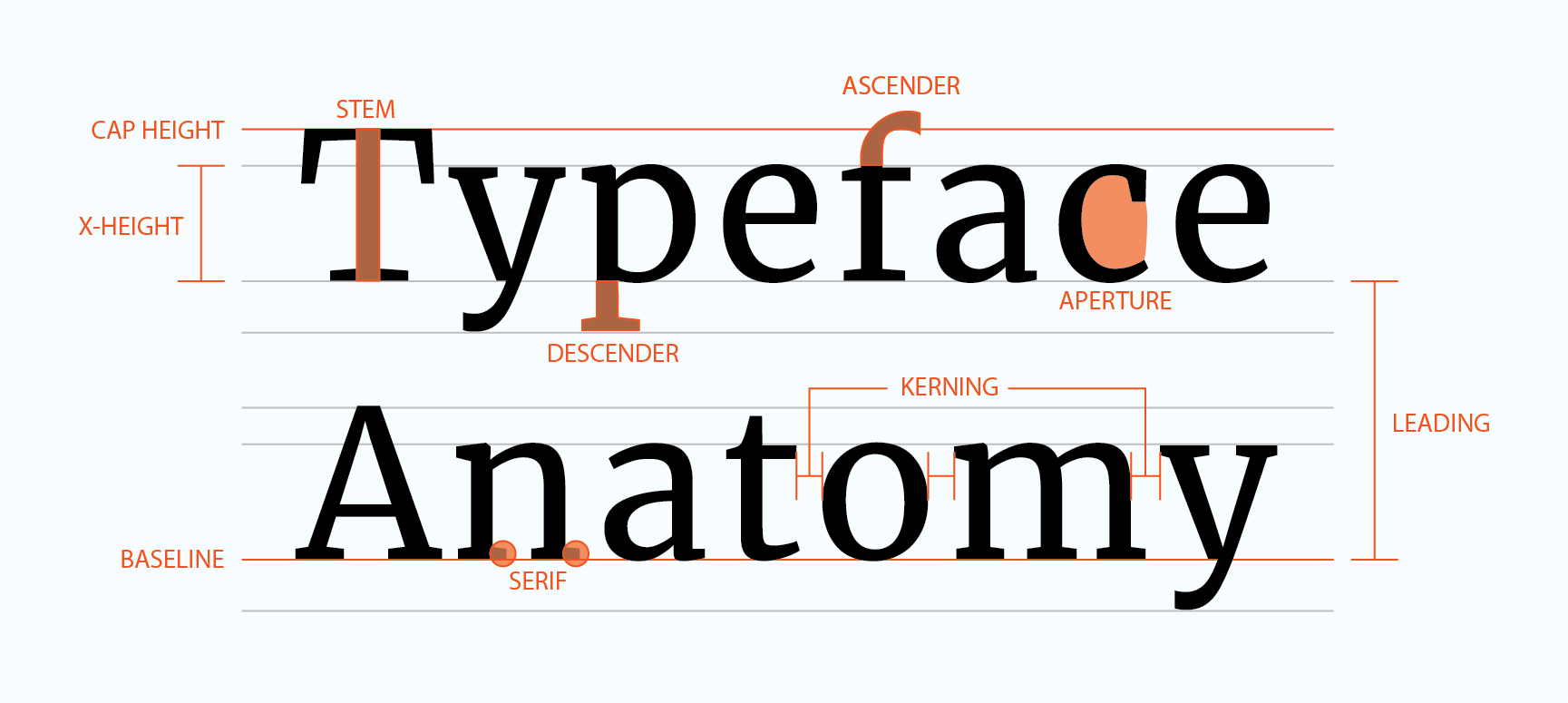
First, we need to understand the basics of typography. Typography is a set of characters that have the same style. This is what determines how text is displayed on a screen or page. There are 5 key elements to typography: font style, size, weight, line height, and spacing. A font style is the style of a set of characters. There are 4 types of styles with tons of typefaces (we will discuss this later). A font size is just how big or small the font appears. A font’s weight is how thick or thin characters appear. A font’s line height is the distance between 2 rows of text. Finally, a font spacing (or tracking) is the spacing between characters.
Why is Typography so Important?
The reason typography is especially important is because it communicates with a person. On a website you want to catch the user’s attention with Bold. Or if you want to communicate luxury. Or a casual font like the one you are reading now. So, when picking out your font you want in to represent your message. And it can be more advanced if you want, for example, for men products, they tend to be sans serif strong bold characters like Gillette, but woman products are serif and “girlish” like Dove.
Different Types of Fonts
There are 5 main types of fonts serif, sans serif, script, monospaced and display.
Serif
Serif
Serif fonts have little decorative lines at the ends of each letter. This has a formal look. This font is harder to read so you will need to make font size slightly bigger.
Sans Serif
Sans serif
Sans serif have no decorative lines. This font has a modern clean look. This is the easiest font to read and great for titles.
Script
Script
A script font Is like the stroke of a paint brush. Most of the time linking letters together. Adding a script is best for designs as they are unique for example the barbie logo is a script font.
Monospaced
Monospaced
Monospaced fonts are characters that have consistent spacing from each other. Which means this makes everything aligned and proportional to each other. This gives a typewriter look. These fonts are popular for coding and data tables as they are extremely easy to read.
Display
Display
Display fonts are big, unique, attention-grabbing fonts. These are used more for posters, book titles, branding, etc. We can see this font in the Coca-Cola logo and the Disney logo.
How to Pair Fonts Together
When picking your font or fonts you want to pair them together. Pairing them together can make everything more appealing and easier to read. I am going to give some ways that you can mix and match your fonts.
If you are using 2-3 fonts. This can be used for everything and is the best option. Using 2-3 fonts adds contrast and makes it more appealing. Just like using one font you can also mess with the weight and size but with 2-3 fonts you can really mix things up. There are many ways to mix up and add contrast to your font, but I am going to give you the 3 main ones I use.
The first method I like to use it to use a sans serif font and a serif font one for heading and one for text. Then for links, buttons, I can do special decorations like underlining, italicize, bold, etc. which will help make things pop out to people. The second method is the one used in this blog. I used 2 sans serif fonts, and I mixed up the weights fonts sizes and the style of them and used them in different areas. So, my first font is Josefin Sans this is used for headers, sub headers, call to actions. You can make it bolder, a distinct color and the font size bigger because I want these to stand out to people. Then my second font, Lato is used for text, links, and certain call to actions. Links are italicized and an assorted color to pop out against the bodies of text. Finally, my third method is to just use one font and change the style of them.
So, for example, my headers are going to be bold, bigger, and a different color, then to be able to use the same font and contrast them I make my text thin or light. I can make links, and call to actions standout with a color change, bolder/italicize, and capital letters.
Just a quick tip with any online project, assignment paper, work, presentation, anything that you make online. Use 16 pixels for text and nothing less. 16 pixels is a size that most people can read without any issues. Sub headers should be slightly bigger and then headers should be bigger than sub headers.
Tools and Resources for Choosing Typography
There are many tools you can use to find fonts for your needs, Google fonts and adobe fonts. Google Fonts is free, you can download as many fonts as you want. Adobe Fonts if you have adobe products its best to use this. Fontpair is good for getting font pairs or just ideas of good fonts pairs. Typewolf has the same stuff as Google fonts but instead has a bunch of script, handwritten, special types of fonts. This is good for designing.
Key Takeaways on Typography in Web Design
Picking the right typography for your project can make an enormous difference to how your website, presentation or resume looks and how people will experience it. By picking the right typography, pairing them correctly, and making sure they work with various devices, your project will look good and will be easy to read. So, look at your project and see how you could improve your typography. With a little bit of testing and using the information you learned in this blog, you can make any project, website, or any work look like a piece of art with the right fonts. If you want to learn more check out my blog about Website Color Trends. You will learn how to pick perfect colors and fonts for any project
Sources
https://zapier.com/blog/google-fonts-how-to/
https://www.canva.com/learn/typography-guide/
https://visme.co/blog/pairing-fonts/
https://www.elegantthemes.com/blog/tips-tricks/font-pairing-principles
https://www.typewolf.com/guides
https://fonts.adobe.com/
https://fonts.google.com/
https://www.fontpair.co/
https://www.typewolf.com/recommendations