Introduction
Do you know how to effectively use a call to action (CTA)? Do you even know what they are? If you use a call to action correctly, you can increase your sales and make users get their problems solved quickly. A call to action needs to be able to stand out and have a clear message. Also, I will teach you how to test your call to actions on your website. I will provide an example of a company’s website with a good call to actions.
Call to Actions
Your call to actions needs to stand out on your site. It needs to immediately catch the attention of users when they enter your website. A call to action can be a button or link. Your call to action needs to contrast with the background of your website. Use shapes, fonts, and colors on your buttons, white space, borders, shadows, and icons. Adjusting the size and position of your buttons is important. Most likely you want your button in the center of the page and the length depends on where the call to action is. If it is in the header you want a large CTA, below the header you want a subtle CTA to avoid distractions.
A/B Testing
To make sure your call to action is most effective we can use A/B testing. A/B testing is when you compare two different versions of your website to see which one has better conversion rates. To do this you need tools like Google Optimize, Optimizely, and Unbounce. These will be used to make two versions of your site. Then we can use Google Analytics to measure the performance to see which CTA has the most conversions. Finally, you would keep the one with the most conversions and get rid of the others.

Square
Square is a great example of a website with a great call to actions. Their CTA is the first thing you see as you load the site and you immediately understand what the button does. Also as you scroll down there are CTAs everywhere they use buttons on the header and links everywhere else. They use an accent color on their links which is the opposite color of the text which makes that link stand out in a sentence or paragraph. Users will see that link and are more likely to click on it. This is where you can sell users which is what Square did perfectly.
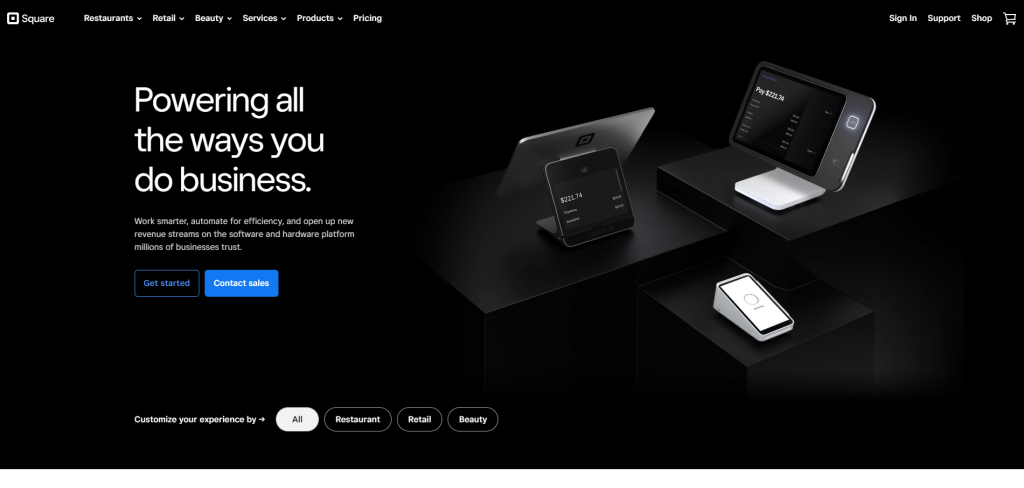
Their buttons are nice looking using design elements like rounding the corners using the opposite colors on the background and different font colors. Square also uses multiple different styles of buttons when next to each other and when trying to get the user to do different things. So to sell the user they will do a blue and to have them learn more they use clear buttons with white font. When you make your CTAs make sure everything is different than the background color, font color, etc.
Conclusion
In conclusion, using call to actions correctly can increase your sales and get what the user needs quickly. By making a call to action stand out users are more likely to click on it, improving your chance of getting a sale. Make sure to test your CTA using A/B to improve conversion rates. Square is a great example of a company that uses good CTAs. Their buttons and links stand out using their accent color and opposite colors on the background. Designing your CTA and testing it will improve your sales and conversion rates.
If want to make your CTAs more effective go to this blog to see if you could use a website redesign.