Want to see the 10 Web Design Fails? well, you’re in the right place! These websites we will be looking at today look like some 5-year-old in his basement made. You will be surprised at how many popular successful companies have such poop websites.
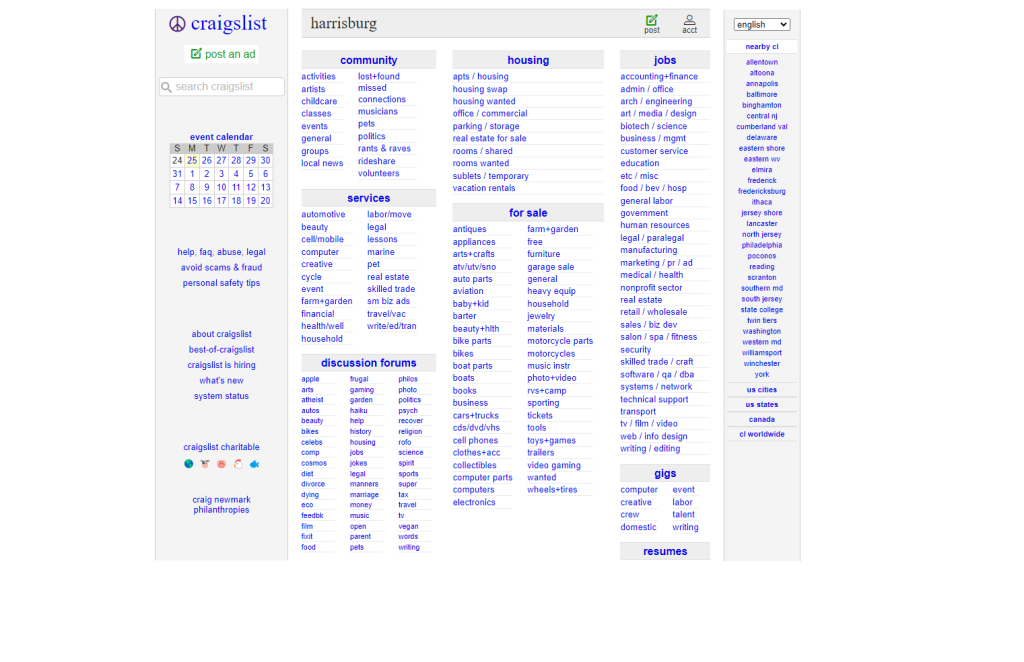
1. Craigslist
For such a popular company Craiglist just decided to put a bunch of links. Those links cause blindness you can barely read them.
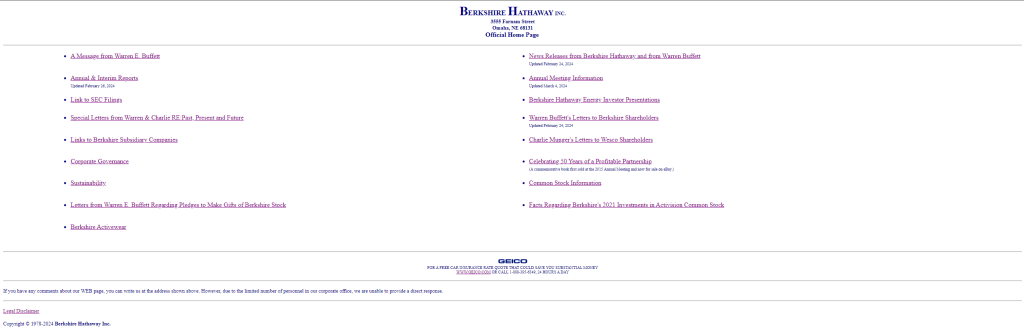
2. Berkshire Hathaway Inc.
This website is clean and simple but it’s too confusing. This has a bunch of links and doesnt tell you what they do.
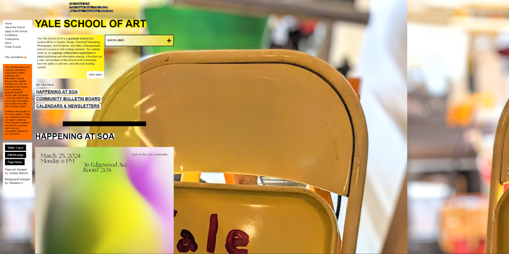
3. Yale School of Art
For a school that costs 70k to get into they couldn’t invest a little bit into their website. Their website is blinding, confusing, and makes you vomit. It makes you wonder if they are a good art school or not.
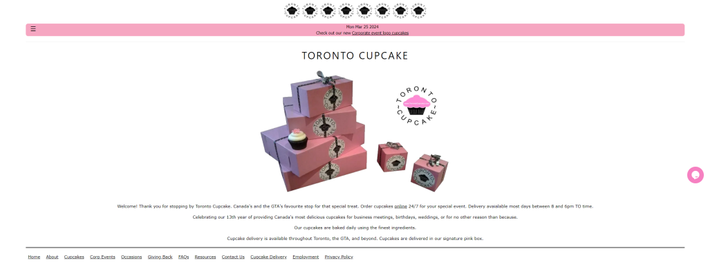
4. Toronto Cupcake
This company is obsessed with its logo. Their home page has 15 cupcake logos. There are so many logos in the header that they had to put the nav bar on the bottom. They must also love their box too.
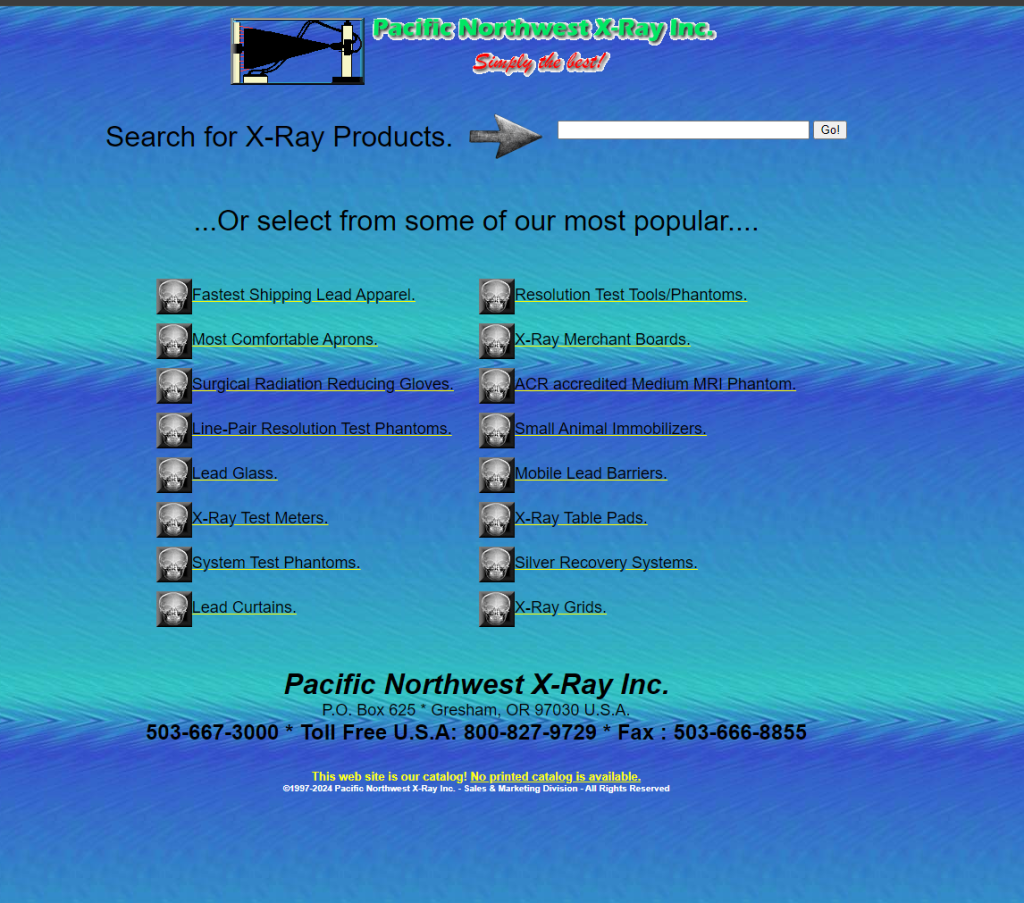
5. Pacific Northwest X-Ray Inc.
This X-ray company decided to make its entire website an X-ray. They also display the most popular products but where are the others? The search bar doesnt help.
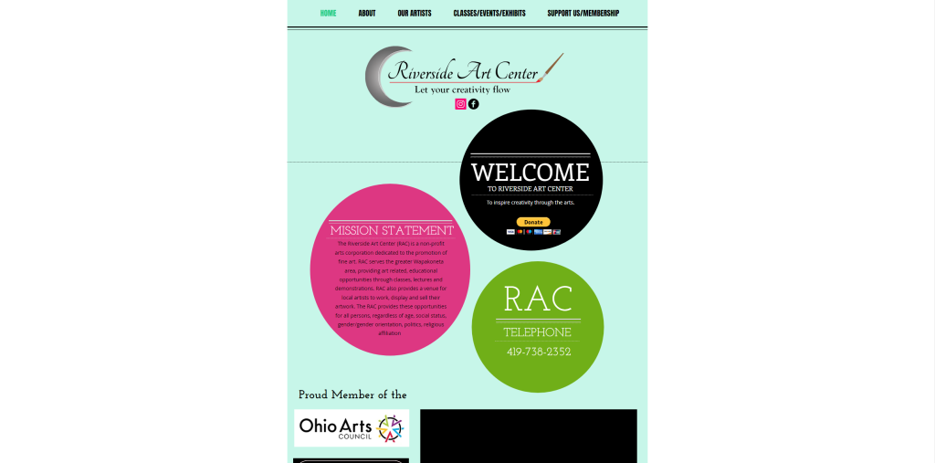
6. Riverside Art Center
This is another art school. This one has fonts that are too hard to read, text too small, and blinding colors. At least its better than Yale of Art’s website
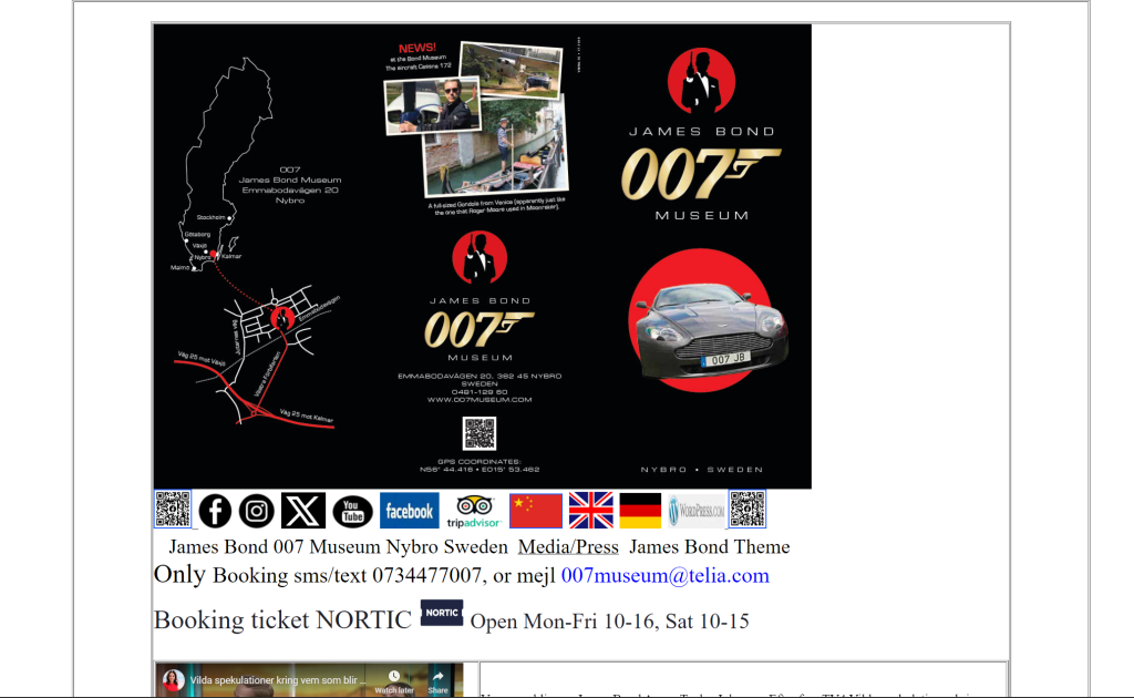
7. James Bond 007 Museum
This Website has a bizarre structure and is very confusing. There is an image when you open the site. No header with links. Then you have the randomly embedded images. Finally, as you scroll down it shows things that are exhibited in the museum with random-sized fonts on each one and so many capitalized words.
8. Atari Best Electronics
My first-ever website looks 100 times better than this website. All the paragraphs confuse users. They don’t even know where to start. Also, their website is a maze when searching for products. I could finish a cornfield maze before I find a product I need on this Site

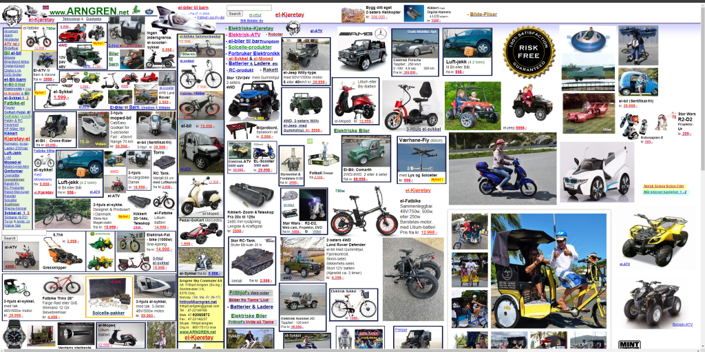
9. Arngren
It’s a very confusing site with all the links on the left and these images and text all over the place with different products. But I’m trying to figure out how is this even codable. It would take someone a week to do this and update all the products.
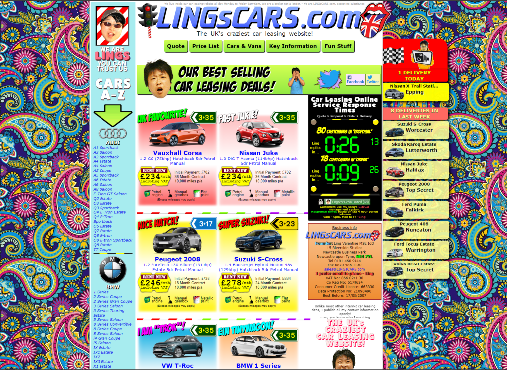
10. Lings Cars
Ling’s car is too flashy and makes you confused about what you’re looking at. This is also not responsive but I don’t think this site is even possible to make responsive. This makes me want to bleach my eyes.
Conclusion
Those are the top 10 Web Design Fails I’ve seen to date with the last two leaving me with bleached eyes and a fried computer. Anyway, if you want to know how to make your website look better than these go to my Balance Functionality and Creativity blog